06: Shades of White - Picking Paint Colors
- Zia Eubanks

- Jun 16, 2024
- 2 min read
Updated: Jun 18, 2024
“It's a good thing that when God created the rainbow he didn't consult a decorator or he would still be picking colors.” ~Sam Levenson

Why is it so hard to pick colors?
I decided to paint the walls a shade of white. Just writing that makes me laugh. You would think that white is just white. But no, there must be a hundred shades of white. White with yellow, green, blue, red tints. Gary white, tan white, off white. OMG!!
I finally narrowed it down to two shades of white, but they seemed so “hospital white” that I went back to the drawing board. Another trip to Home Depot for more samples.

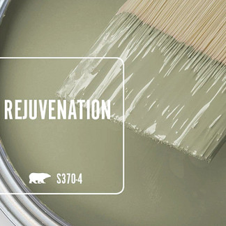
After an exhaustive decision making process I found a color called Mascarpone. Honestly, it was recommended by a designer I follow on YouTube. It has hints of yellow, but is more creamy. The sample looks way more yellow than it does on the walls.
We painted one corner of the living room with two coats and I decided it was the winner! It looks fresh and clean and really brightens up the space. It doesn’t look yellow at all, and it doesn’t look like a hospital either. It allows the views to be the star.

Since we plan on living here for a while, but eventually selling I decided to stay neutral. Seems like a safe bet. But I am a person who LOVES color. I have never been shy about decorating with color. It makes me happy.
So I had to decide where I could bring in some color that wouldn’t be too risky for resale. Honestly, I don’t think I am the best judge of that! But, I’m trying.
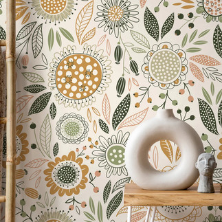
I decided the buffet would be one place I could bring it in without being too offensive. I plan to use a pretty wallpaper on the back wall and paint the cabinets a complementary color. Then, I found a kitchen backsplash tile that would accent the design. It will bring in some style without being too color forward. I hope!
My rebellious colorful self says, “who cares - go for it!” Most of the time I listen to her.


Here are my top choices for wallpaper, cabinet paint and backsplash tile.
I really like it!
I know it’s bold.
But, it feels cheerful and brings elements of nature inside. It’s one of those things that you have to see when it’s all put together. I’ve got to trust my instincts and go with it.
Since we will likely be living here for at least a year, I’m going to create an environment that suits us and know that when it’s time to sell the perfect person (people) will fall in love with it!
Color is nothing to fear!
I’m going for it!


Comments